LEARNING
These short videos will help you master many of the most common Dyntell Bi functions you’ll need to create beautiful and powerful visualizations and analyses.
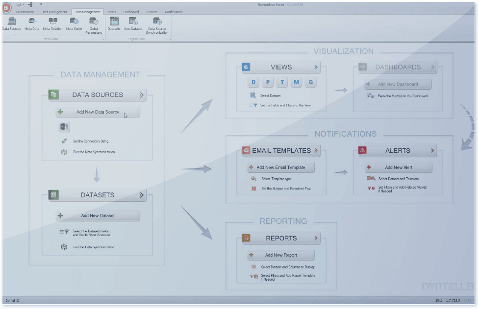
Connecting Data Sources
Learn how to connect data sources and data sets in this brief video.
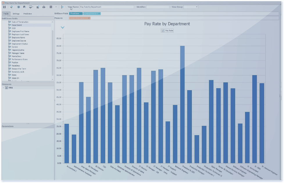
Managing a diagram
Watch how to create, manage and analyze a diagram in this short video.
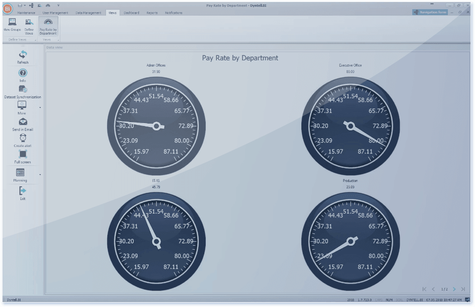
Creating a gauge
See how to make a beautiful gauge and use it to analyze your data!
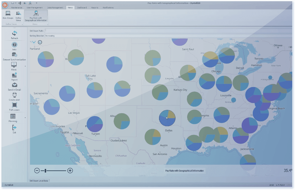
Creating a map
Find out how to create a data-rich map for stunning visualizations in this quick video.
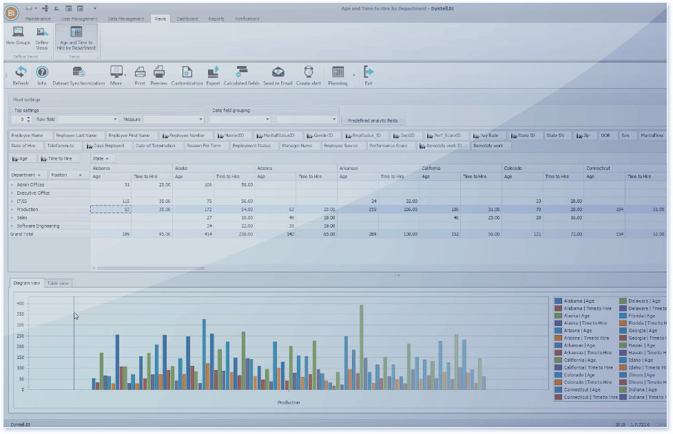
Creating an advanced pivot
Learn how to make an advanced pivot chart and use it to analyze your data.
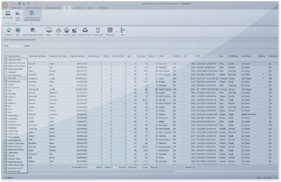
Creating a table
See how to create a table and use it to analyze your data in this brief video.