Whether you’re a data analyst, manager, or team leader, pitching your ideas and newfound insights to upper management can be daunting. Will your message land? Will they be on board with your big discovery? Is your presentation impactful enough? Data rules the roost and using tools like business intelligence software to filter, analyze, and visualize complex data sets are now the norm. Crafting these visualizations into easily digestible, compelling, and convincing presentations is the real challenge. Audiences should be able to see and understand a slide or image within three seconds, otherwise, you’ve lost them. The Glance Test, as it’s called, is just one way to improve your data visualizations. Here are six more.
1. Keep it Simple.
KISS (keep it simple, stupid, or the more diplomatic keep it short and sweet). How many times have you heard this? It applies across industries, fields, and just about everything we humans do. Yet so often we overcomplicate and over-explain. And when it comes to data visualizations the old adage definitely applies. Avoid complicated, high resolution imagery as it will slow load times. Overly flashy colors should also be switched out for more neutral tones, and care needs to be taken when it comes to backgrounds and how they relate to the data presented. Data on a chart and its related text should be the same color. Any borders, text, extra flourishes, and legends should be kept to a bare minimum. Remember— ‘less is more’.
2. Create a Compelling Narrative
Sure, strong data insights can speak for themselves but don’t leave it to chance. 55% of people say a great story captures their focus and keeps them engaged. What story are you trying to tell? Keep this in mind as you create your pitch and use signposting to keep your audience engaged. Now, this doesn’t need to be a fairy tale, just keep them reminded of what the big picture is and who the main players are. It could be a presentation about customer engagement and you could simply create imaginary characters who represent the data throughout your narrative.
3. Layout design for maximum impact
What part of a screen or page do people’s eyes jump to first? That’s right, the upper left hand corner followed by a left to right movement. Your most important visualization or talking point in a set should be placed in this location and in general, more important data should be larger in size. A centered positioning of priority data also gets the job done. This may seem obvious but it’s easy to get lost in the content rather than presenting it successfully.
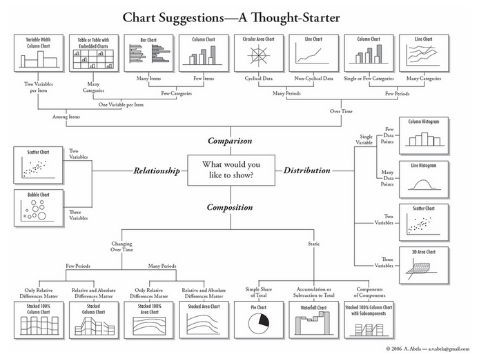
4. Choose your weapon wisely
How you visualize your data points can make or break your presentation. This cannot be overstated. There are numerous types of graphs and tables that can be displayed within a BI dashboard. The one that fits best for your data is something you’ll need to figure out. This begins with being familiar with various visualizations and how they best display different types of data. Pie charts, for instance, are perfect for displaying percentages or proportions within a category. Think user preference of streaming music platforms for a set time period. Line graphs on the other hand are suited for visualizing trends over time. The popularity of keywords over a year, for example. Look for a BI solution that provides a multitude of visualizations to suit your needs.
5. Know thy audience
Perhaps this should be higher on the list as it’s probably the first point to consider. Who is this visualization or presentation for? What is their familiarity with the concepts you’re presenting? Does the language you’re using match their knowledge? Why should they care? Speak to your audience in their language, whether it’s finance, marketing, executives, HR… make sure you’re giving them a path to relatedness and how it fits into their world. A compelling pitch needs to connect. Keep tech talk to a minimum!
6. Be crystal clear on the call to action
No presentation is complete without some type of call to action (CTA). Whether it’s a purchase or your audience now seeing you as an authority on the subject, you’re always ‘selling’ something. Many a great pitch has been sunk by a weak CTA or simply none at all. While not everyone wants to hear a sales pitch, most do want a clear idea of what they can do with this newfound knowledge you’ve given them. Finish strong with a thought-provoking question or a sense of urgency and most importantly, very specific actions you’d like them to take. This can of course be a strong, undeniable visualization that presents your main point. And last but not least, please don’t finish with a ‘Thank you for your attention’ slide!
Curious about how we help organizations get the most out of their business data? Contact us today for a free consultation and begin your data-driven journey.